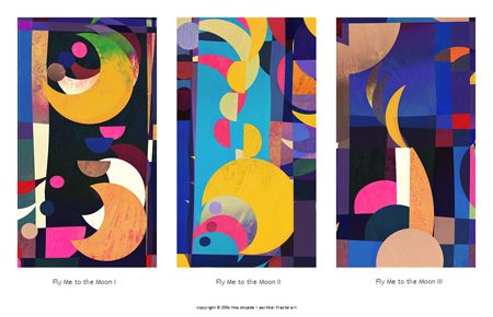
Fly Me to the Moon by Tina Oloyede
I Know What I Like — Or Do I? Part One:
Last time, I was on surer footing as I attempted to explain why I know what I like when viewing fractal art. I admitted my bias for the painterly over the photographic, as well as my preference for work that strives to be about something more substantive than attractive decoration.
My complaint with most fractal art is that it cannot generally be "read" — that is, it suggests no levels of meaning beyond being (usually) lovely art for art’s sake. There’s nothing intrinsically wrong with such art, nor do I assume it is necessarily easy to create. It’s just that I find a steady diet of such fractal dulcification eventually leads to a kind of aesthetical diabetes. The preeminence of such eyecandied confections in our community has resulted in what Tim once labeled "the fractal craft guild." If our discipline’s "best artists" have no higher aim than continuing to churn out beautiful but meaningless objects, whether in 2D or 3D, then I fear fractal art will continue to be broadly viewed as fancified kitsch rather than purposeful fine art.
The fact that exhibitions like the Benoit Mandelbrot Fractal Art Contest (BMFAC) further codify the belief that beauty is an end in itself and continue selecting decoration over substance makes the drought of meaningful fractal art linger longer. And never think outside the well-adorned, prettified box on Fractalbook, or you’ll face the likelihood that your comment stream of effusive kudos will shrivel and mummify like a shrunken head.
Naturally, I feel fractal art’s finest practitioners typically strive for a meatier meaning that surpasses ornamentation. But how does one go about "reading" that meaning — especially since visual art, like text, can be read in numerous ways, including through the divergent filters of narration and aesthetics?
I expect to find myself stumbling around in a darkened cave over the next several posts. Why? Sometimes I don’t know why I like certain artworks or artists. There’s a difficult-to-define something in certain works that somehow affects me — that when experiencing them "I feel physically as if the top of my head had been taken off," as Emily Dickinson once described how she recognized poetry.
Here is the first of three artists who sometimes lifts my scalp and tickles my brain.
~/~
Tina Oloyede
Of the many artists who initially coalesced around the (primarily) Ultra Fractal-using contests and eventually settled into a circle spear-headed by Damien Jones and his Fractalus site, I always thought the most promising, if not most gifted were Alice Kelley and Tina Oloyede. Although much of Oloyede’s work stays true to a decorative style pioneered by Linda Allison, Oloyede sometimes wanders afield with spectacular results.
Fly Me to the Moon, above, is a good example of Oloyede in a more experimental mode. The piece is actually three works melded together to form a triptych. The title, a song most famously sung by Frank Sinatra, and a metaphor for being carried away with love’s rapturous abandon where one can "swing among the stars," here offers a more stable romance with the promise of multiple bliss trips. I find it comforting that ecstasy transportation comes thrice.
The lush, deep tones and modernist composition suit Oloyede’s work well. The cut-up technique becomes near-cubist in nature, as the recursive moon forms fall in and out of shadow or undergo various phases and eclipses. The textural patterns embedded on many forms often suggest the pockmarked lunar surface ravaged by meteor scarring — or, in the lower section of the middle image, geological surface features of the earth being orbited by its lone circular planetary satellite.
And I love how Oloyede uses space (no pun) in this piece. The forms seem to pulsate with motion and whiz in and out of the frame of our telescopic view. Plus, the white spaces formed by the triptych function like the gutters in sequential art and capture the sensation of watching time-lapse photography as the viewer scans the entire composition from left to right.
Although we are unable to hear the music of the spheres, it seems Oloyde has provided us a glimpse of a live performance.
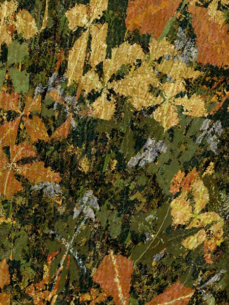
Pond Life by Tina Oloyede
Fractal forms made with software often mirror their natural counterparts — like ferns and trees and flowers. But it takes both craft and talent to skillfully fuse the natural world with a digital composition, as Oloyede does with Pond Life. Absent narrative, the piece primarily relies on the aesthetic pleasures of a landscape or still life. The black background provides a sense of depth for the muted browns and yellows — which, in turn, call attention to the varied shades of green found in the living vegetation. The grey forms, however, suggest nature in decay, although the similarly colored lines running through the work could be interpreted as nourishing veins.
Upon closer inspection, considerable textural detail can be seen on individual leaves. Color variance provides contrast, too — even among forms of ostensibly the same color. The painted quality of Pond Life intentionally distorts the high-def clarity of nature, and, in a Brechtian sense, gently reminds us that the "snapshot" is constructed — is a made object. Finally, the entire work is filled with a feeling of distorted motion. Everything seems to be caught in the frozen moment of upward movement, thus adding even more depth as the forms appear to be extruding out from the darker background and seeming almost tactile enough to touch.
I’ve seen many natural forms make their way into fractal images, but very few are as aesthetically successful and creatively arranged as this piece.
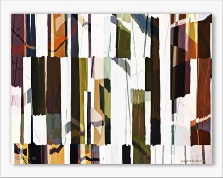
Crackerjack 003 by Tina Oloyede
This is another non-narrative piece that relies on its design features for impact, although I enjoyed reading comments on Renderosity comparing the image to flags and hanging laundry. The interplay of shadows and light is certainly efficacious. The vertical and perpendicular forms establish a formal pattern which is then forcibly chopped by the cut up but near-self-similar arrangements seen on the top and bottom. The fracturing achieved by hacking formalist traits creates the sizeable tension this piece exudes.
Further adding to the sense of unsettling discombobulation are the seemingly random horizontal squiggly lines compartmentalizing the piano key-like rows and rendering them even tauter. The addition of scattered, faded forms, which function as shadows drained of their once potent energy, supply both perspective and depth and imply a level of intensity that risks blow out.
My one complaint with the piece is that I find the tacked-on frame to be unnecessary and distracting, although one might argue that its shadows add to the illusion of depth. To be fair, I admit to a general dislike of the use of digital frames. They nearly always seem contrived to me — and, if they cannot be cleanly removed, can ruin printmaking possibilities.
Crackerjack 003 lives up to its name. This piece pulses with an unnerving, abstract energy. I see this artwork was submitted to last year’s BMFAC — and did not make the cut. Considering some of over-embellished schlock that won — like this and this — all I can say is, well, Tina wuz robbed!
~/~
Up next in the series: Art by Jennifer Stewart.
Intresting article and very nice artworks from Tina Oloyede!
Greetings Dawid.